
Now in its second decade, the Armory Show — which in 1999 itself appropriated the name from the historic 1913 Armory Show — is far past its mythic origins of 1994, when the fair opened in the Gramercy Hotel and art was displayed on hotel room beds.
Call it a hangover, historical whiplash, or just déjà vu all over again, but the current Armory Show is rife with quoting and cross-referencing across periods, styles, and continents. Some of this is great. It means there’s a rich conversation between the 56 galleries on Pier 92, where the modern work is installed, and the 143 dealers on Pier 94, which theoretically features newer contemporary work. Sometimes within the context of the largest art fair of the season, however, context itself can get lost.
A work that might serve as a signpost for the fair is by the Danish collective Superflex, on view at the Los Angeles gallery 1301PE in the contemporary section. It is a photo print on vinyl that remakes a well-known Barbara Kruger work. Only, instead of Ms. Kruger’s text, which said, “I shop therefore I am,” rephrasing Descartes for the go-go 1980s, Superflex’s version from 2009 reads “I copy therefore I am.”
Copying shows up all over the place. At Kukje/Tina Kim, the Korean artist Kyungah Ham has appropriated the compositions of the abstract painter Morris Louis. Only, instead of paint, Ms. Ham commissions North Korean workers to embroider her canvases, smuggling them out of the country through China. At Cherry and Martin, Brian Bress’s grid of glowing digital light boxes is called “370 Cover” (2015), and it “covers,” using the pop music term for a remake, Sol LeWitt’s “Wall Drawing #370” (1982) at the Metropolitan Museum. And so on.
But quoting serves as a historical bridge between sections of the fair. Some of the Modern works seem as if they were made today. Leon Tovar has several works from the ’70s by Jesús Rafael Soto and Carlos Cruz-Díez that you walk in front of to activate their sense of movement. Zucker Art Books has works from Dieter Roth’s first exhibition, including his “Stupidograms” (1960), drawings made with typed-out commas; and “landscape collages” made with postcards of Iceland.
Sometimes the historical overlap feels direct. Moeller Fine Art, in the modern section, has several good, small owing a very Zero-looking “Concrete Clock (I1)” (2014) by Klaus Weber.
Sims Reed has a great collection of Bridget Riley prints from the ’80s and ’90s in the modern section, and her influence reverberaLouise Nevelson works, identifiable by their pieced-together wooden construction, painted monochrome black or white. In the contemporary zone, Sadie Benning is doing a similar jigsaw-puzzle thing at Susanne Veilmetter with primary-colored works made of medite, aqua resin and casein. Beck & Eggeling has sculptures and wall constructions by Zero Group artists like Gunther Uecker and Heinz Mack, while Andrew Kreps is sh tes on Pier 94, in an LED lightbox by Spencer Finch at Lisson and in Peter Schuyff paintings at the Brussels gallery Sorry We’re Closed.
Franz Erhard Walther, a German artist who fell through the cracks of history here and was revived with a 2010 Dia: Beacon exhibition, appears on both piers. In the modern section, he is represented by fabric and wood constructions from the ’90s at Munich’s Galerie Thomas Modern; Berlin’s KOW, on the contemporary pier, has dedicated part of its booth to similar works by Mr. Walther.
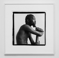
Other historical shows in the contemporary section include a flashy installation of Daniel Buren, the master of stripes, at Kamel Mennour. Higher Pictures has a great little presentation of George Dureau’s black-and-white portraits from the ’70s and ’80s of denizens in the New Orleans French Quarter. The enduring Alex Katz appears in the contemporary section at both Peter Blum and Monica De Cardenas. A more sedate solo show of Irma Blank is at Alison Jacques. Ms. Blank’s works from the ’70s through the ’90s use ballpoint pen, ink and watercolor to create dense fields of blue that, on closer inspection, are made up of thousands of tiny marks.
One of the better reasons to visit an art fair is to see what has generated in the global art world over the last year. Omar Kholeif, a curator at the Whitechapel Gallery in London, was commissioned to bring in artists and galleries from the Middle East, North Africa and the Mediterranean.
Mona Hatoum’s “Turbulence (black)” (2014), a sleek, circular floor installation presented by Alexander and Bonin, is in this section. Another eye-grabbing installation is Ahmed Mater’s at Athr, a gallery from Jeddah, Saudi Arabia, including a wall work made with plastic gun caps, “Cowboy Code II” (2012), which links the honor code of American cowboys with jihadist fighters. In the modern section, a related “focus” project brought a mini-exhibition of work by Iranian artist Parviz Tanavoli, organized by New York University’s Grey Art Gallery.
Among the larger contemporary galleries, however, there is an overall feeling of business as usual, perhaps even malaise. This is to be expected. The New York Times reported in January that there is an “art fair fatigue.” With roughly 65,000 visitors, the Armory Show, despite being the biggest in New York, is only one among others — and not even as big as mega-fairs in Madrid, Miami, Buenos Aires, Istanbul and Paris.
Still, art fairs remain great places to see new work, to learn about galleries outside of your region and to experience the ebbs and flows of art currents. Given the acceleration of history, perhaps the Armory itself is ripe for appropriation, historical reinvention or revival.
More information available at: http://www.nytimes.com/2015/03/06/arts/design/review-the-2015-armory-show-overlaps-history-and-cultures.html?_r=0