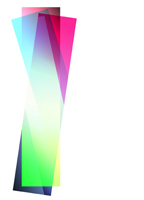
Artie Vierkant works with shaped canvas, except that it is not shaped and not canvas. He makes color-field painting, only without paint, and the colors make gradual but striking changes as they cross the field. It is geometric abstraction, but with unexpected gaps in the geometry and translucent layering of its outlines. It is digital art, but in a strikingly physical space, and it does not look anywhere the same on computer. For all that, it is quite literally cut and dried. Oh, and I everything I just said is, at least a little, wrong.
So pardon me if I start over. Vierkant follows a late modern tradition, in which abstraction is not necessarily the spiritual, as for Wassily Kandinsky, but exactly what it is—a literalism that invites words while defying one to use them. He is showing at a gallery founded to recover the history and significance of photography, at Higher Pictures through October 27, and these are color prints. They are ink-jet prints, though, and there was no lens and no camera. And he prints them on Sintra, a hard foam board related to PVC, slightly skewed from the vertical and under six feet tall. Two with curves face each other, in an artful hanging, while the one square has a gaping hole in the middle.
Shaped canvas has generally meant angling wood piece by piece, as for Charles Hinman, before stretching canvas. Vierkant machine cuts his materials, and his color fields derive logically from the work’s outlines, just as for an early Frank Stella. However, he composes on computer, with stern titles that date each Image Object right down to the minute. He intends additional work as purely virtual, although this show seems designed to prove him wrong. Stella’s generation already pushed the impersonality of the machine quite hard enough, thank you, but now the logic is getting all the more thorough—and also more confusing. Think of it as the space between the mechanical, the personal, and the visual.
In fact, only color allows one to imagine the outlines as part of a rectangular geometry. The work sure looks like overlapping rectangles, likes panes of colored glass. These in turn create new colors, but even then I cannot promise to account to them. They also show gradations within a field, and if the overlap accounts for them, fine. If not, maybe that, too, is the point. Color has become a mark of transparency.
For an added touch of logic and sheer happenstance, the artist’s name means four corners in Dutch, but he is a New Yorker under thirty. No wonder he is attached to the computer. And sure, in trying to pigeonhole the work, I could mention new media. Color becomes fused with materials, almost as for industrial design in plastics now. Throw in an older concern for art and optics, color charts, and color wheels as well. Breaking the boundaries between media, between geometry and gesture, and between abstraction and symbolism has helped to revive them all.
Vierkant just makes it harder to describe them. Color fields extend to the work’s edge, just as with Stella in the 1970s or Gerhard Richter now. They also have a little of the same “pop,” but without trying to blow one away. Instead, they draw one in. There may yet be a gleam or a shadow that one had missed. There may yet be a curve
More information available at: http://www.haberarts.com

